Cupertino is an Obsidian theme, optimized for desktop and mobile devices. Bringing clean, focused, comfortable reading and writing experience to your vault.
Looks pretty nice, but… it is still Electron under the hood.
Cupertino is an Obsidian theme, optimized for desktop and mobile devices. Bringing clean, focused, comfortable reading and writing experience to your vault.
Looks pretty nice, but… it is still Electron under the hood.
I’ve been running macOS Tahoe‘s new Liquid Glass design on my MacBook Air for a couple of days. Parts work, parts don’t, but most people will adapt quickly enough.
The smart thing Apple did was leave 3rd-party apps alone. They run with the previous design intact, giving you familiar anchors while you adapt to the new interface. Electron apps will probably never update, which might be a blessing.
The dynamic background adaptation is broken. Buttons shift from black to white as the background changes, and it’s jarring every single time. Toolbar consistency is all over the place too. Photos and Mail use progressive blur with gradients while Safari keeps the old blurred rectangle, with no apparent logic to which apps get which treatment. Scrolling through Photos is particularly painful as the interface flips from black to white and back again as you move through your library. This isn’t a minor polish issue. It’s a fundamental problem with how the adaptive system responds to content, and Apple should fix it.
When the general public gets their hands on Liquid Glass, I’m sure people will complaint. The current state is too buggy to survive contact with millions of users. I expect iterative improvements throughout the OS 26 cycle as the design gets tweaked based on user feedback.
The foundation has potential, but the background adaptation logic needs fixing. Until then, it’s a work in progress.
Streams are not created on a personal basis, they are shared between people interested in them. Streams are like shared folders for individual threads. This additional layer keeps your communications organized: you don’t anymore have one cluttered inbox, threads are now sorted in streams with authors’ hands. Streams are high-level enough to make inbox organization effortless and not to introduce significant overhead.
Interesting ideas about making email from an inbox to streams.
On my 13” Intel MacBook Pro, the icons reached to about halfway across the screen. On the 14” M3 MacBook Pro, ironically a machine with a larger display, at least 3 icons get hidden.
This “design” (or lack thereof) is so dumb. It is utterly ridiculous to me that this is still how it “works” two years after the introduction of the redesigned MacBook Pro with a notch. How hard could it be to add an overflow menu with a “«” (or should it be “»”?) button that shows the remaining apps and icons that can’t be displayed? This entire situation with the notch is ironic, because the iPhone notch and “dynamic island” are so thoughtfully designed with zero compromises regarding the functionality of iOS. In fact, they actually provide a better user experience. Yet on the Mac, how the notch interacts with macOS is laughably incompetent. It is shockingly lazy regarding attention to detail, and results in an outright disruptive and confusing user experience.
Here’s my current menubar:
![]()
I try to keep my less frequently used icons (like Hookmark) on the left because I mostly invoke them from the keyboard anyway. But I hate when Docker gets stuck behind the notch, and I have to quit other apps on the right to get Docker back to the screen.
Apple should do something about this behavior because it’s really annoying. And no, I’m not going to install a 3rd-party app to fix these issues, even if I love its icon.
Midway through the interview we talk about his work as the production designer on the “Beasts of the Southern Wild”, and then dig deep into the strikingly designed worlds of the first two seasons of “True Detective”.
I loved season one of True Detective.
Three was a topic I saw a couple of days ago on /gtd, where redditors discussed which GTD app is the most good looking. It reminded me of a problem I wanted to write about for a while now: their list design’s readability. I know OmniFocus, Things, and Reminders well, so I concluded my experience about their typography below:
A lot of people would say it’s Things. It has a friendly UI, but from a readability point of view, it is one of the worst.
In my daily work, I have two problems with Things:
- It only displays one line per task, which means, if you have longer task titles, you’ll end with a bunch of text clipped out, which is annoying on an iPhone. You have to open each task to see the full title, which is no fun when you quickly want to review your errands list.
- Things displays every task list grouped by project. If you like me, you’ll usually have one next action per project, so having each project being this prominent is making your lists very noisy.
I stopped using Things because of these issues, and I switched back to OmniFocus, which displays full task titles, and has nicer list readability overall. Apple Reminder is also good at showing lists, which matters the most at the end, so I would go with OmniFocus and Reminders.
Let’s see these apps next to each other. From left to right are OmniFocus, Reminders, and Things.
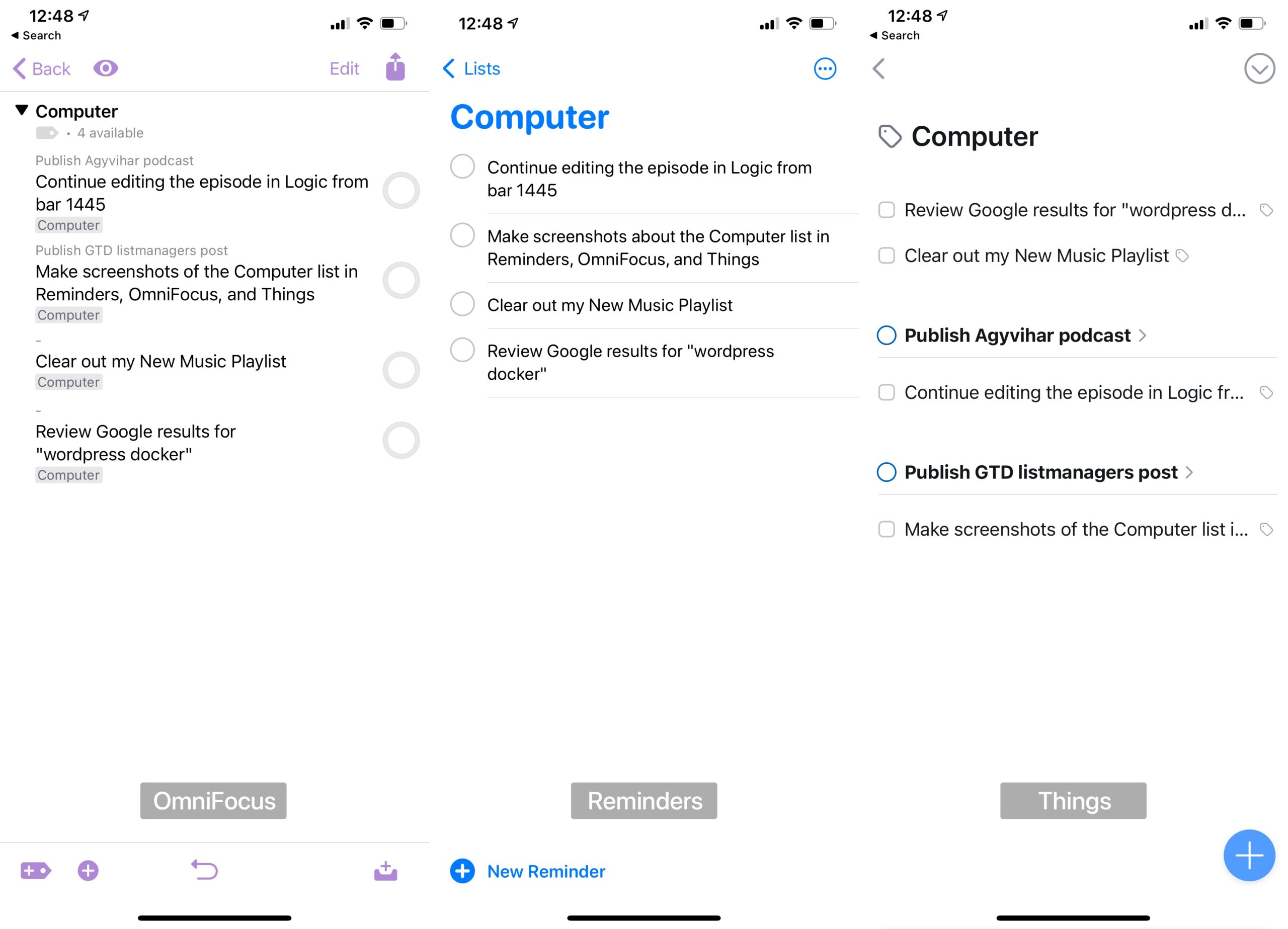
As you can see, Things overflows the text and group actions by projects which makes the readability of a typical next actions list much worse. It was the main reason I left Things after using it for two years and switched back to OmniFocus.
I also made a switch from OmniFocus to Reminders in December, but that’s a topic of another post.
Nowadays, I use SVG icons everywhere, but preparing them is quite time-consuming. This website could help pick and use nicely designed ones for your next project.
The icon transformation process has started.

Siri’s suggestions are starting to get better on my iPhone. Let’s see the following screenshot from yesterday.

I usually write entries to my food log via Drafts and check my sleep patterns in the Health app around noon. These recommendations are spot-on. But I love how Siri recommends Handoff as well.
I was in the middle of reviewing a next action list yesterday in OmniFocus on my iMac, and I had to leave for a couple of minutes. I grabbed my iPhone to continue, and even before starting to search for that specific next action list via Spotlight, my iPhone was already recommending what I wanted to do.
I love small UX surprises like this.
As I refresh my online presence with a new avatar and a new Dribbble profile, it occurred to me that I don’t have a page, which I can hand to somebody, and he/she can see what my work is all about. Not a portfolio, but a more superior page than a simple “About Me” in WordPress.
So I built one, featuring some of my work I did lately and, more importantly, the first web development tutorial I promised a couple of months ago. I plan to extract this article into a separate mini-site just for these tutorials, but for now, it nicely complements my “About” page.
Anyway, check out my work!

It was a long time since I posted anything on Dribbble. In the last couple of years, I did so many exciting things, but I haven’t shown them anywhere; I did show some bits and blobs on Twitter.
Since I like to think about UI interactions and building tools, I should have a platform to show the results. And Dribbble is excellent for that. So from now on, I try to post new stuff I’m working on.
Checkout my Dribbble profile →
(Feedback is always welcome.)

Elképesztő, hogy ezzel az “attention to detail” tudással hogyan sikerült megrajzolni azt a kotonalakú akkumulátor ikont macOS-en.