But using it after spending the day on Things really makes it look like a baby app, like an Electron-packaged web app made by people who haven’t smiled in decades.
😃
But using it after spending the day on Things really makes it look like a baby app, like an Electron-packaged web app made by people who haven’t smiled in decades.
😃
Flexibits just released Fantastical 3.7.9, which adds a bunch of new Shortcuts actions, including the ability to filter events from a given Calendar Set in a given date range, and the ability to generate a simple schedule for a given day.
Nice! I have a shortcut which syncs up calendar events with agenda items in Things. Now, I can automatically do the following in one shortcut:
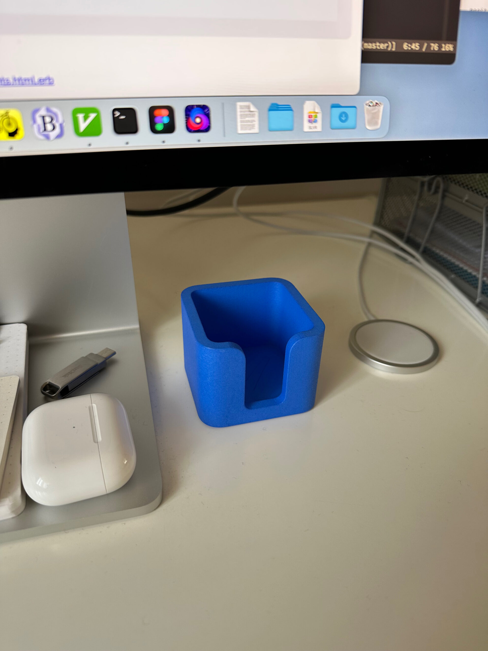
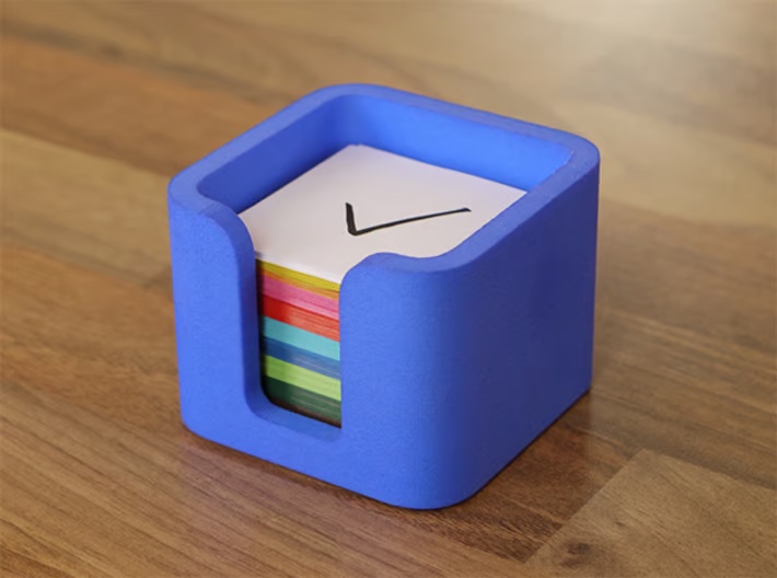
Follow-up: I got my Things Box!

Liked “Things Box 5×5 by culturedcode“.

My wife is gonna kick my ass, but I ordered one. It’s so cute!
I was thinking about making a more advanced GTD system in Numbers other than just using Reminders in macOS. This post lays out this idea in more detail.
We can store next actions of a GTD system in Apple Numbers by creating two tables for “Next Actions” and “Projects”.
Writing an AppleScript for syncing with Reminders should be possible.
I watched a video from Cal Newport on how he uses a simple text file for the sense-making of a bunch of new information. He mentioned that instead of processing his emails one by one, he captures the essence of every email into his text file, then starts to categorize it, organize it by projects, etc. This gave me an idea about solving a similar problem I had with my GTD inbox for a while now.
GTD recommends that we process our stuff in the inbox sequentially, without grouping beforehand. The problem with this approach is that many items related to different projects are scattered in our inbox, so we’re jumping in and out of projects while processing our inbox. This constant context switching drains energy from our brain.
If we want to spare our attention, it is a good idea to group our unprocessed inbox items by project, so we can reduce the context switching when we process them. Using this approach for the GTD Process and Organize steps will ensure that we clean things related to each project in one go, not randomly.
I will show you how to do this inside OmniFocus, but you can also steal this approach for Things using a similar “Process” tag.
The point is to add a temporary structure to information in the inbox. I usually do some form of project planning and next action creation when I’m emptying my inbox. The problem is that I constantly switch thoughts about many different things as I go through each item. It would be nice to have them batched and grouped by their project. This can reduce the attention switching to different topics/projects.
Let’s say we have an inbox like this:
I hate when I have to switch my current context (not my GTD context, but the current mindset that I’m in) and go back to a project I already thought about and assigned a next action to; possibly, I even closed its support material since then.
Having new information pre-organized by projects (or topics) can reduce the load of thinking about a project twice or more in an inbox processing session.

I always get annoyed when I deal with something related to a big project in my inbox, and then 5 minutes later, another thing pops into my view about the same subject. I have to open the project and its support material again, get into the same mindset, and maybe even reconsider everything I figured out 5 minutes ago. It is a dumb way to plan things.
I’ve been pre-organizing inbox actions by the project for about a month now, and I can assure you that having unprocessed stuff grouped by the project can make a big difference. I can process my OmniFocus Inbox about 15-20% faster than before, but more importantly, I don’t feel tired after doing it. I stopped switching contexts for every item; instead, I’m spending more time at the project level and dealing with new things from this perspective.
I wrote a follow-up post to this one answering reader questions about this workflow.
Three was a topic I saw a couple of days ago on /gtd, where redditors discussed which GTD app is the most good looking. It reminded me of a problem I wanted to write about for a while now: their list design’s readability. I know OmniFocus, Things, and Reminders well, so I concluded my experience about their typography below:
A lot of people would say it’s Things. It has a friendly UI, but from a readability point of view, it is one of the worst.
In my daily work, I have two problems with Things:
- It only displays one line per task, which means, if you have longer task titles, you’ll end with a bunch of text clipped out, which is annoying on an iPhone. You have to open each task to see the full title, which is no fun when you quickly want to review your errands list.
- Things displays every task list grouped by project. If you like me, you’ll usually have one next action per project, so having each project being this prominent is making your lists very noisy.
I stopped using Things because of these issues, and I switched back to OmniFocus, which displays full task titles, and has nicer list readability overall. Apple Reminder is also good at showing lists, which matters the most at the end, so I would go with OmniFocus and Reminders.
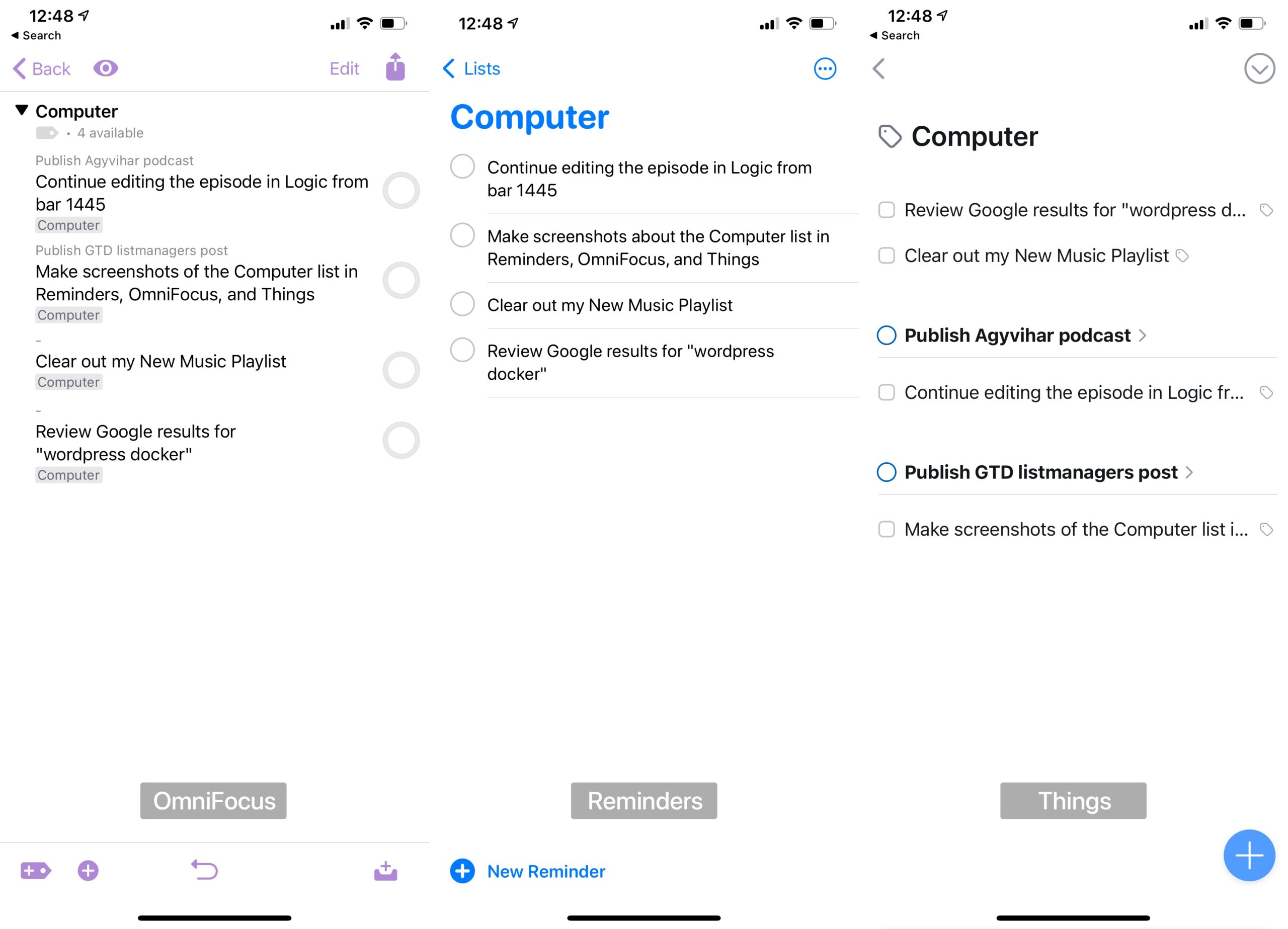
Let’s see these apps next to each other. From left to right are OmniFocus, Reminders, and Things.

As you can see, Things overflows the text and group actions by projects which makes the readability of a typical next actions list much worse. It was the main reason I left Things after using it for two years and switched back to OmniFocus.
I also made a switch from OmniFocus to Reminders in December, but that’s a topic of another post.