According to GDPR, from May 25th I can't talk to myself alone without agreeing my privacy policy first.
2018.05.17.
Leaving Facebook is easy, you just have to leave your laziness behind too
Sarah Jeong writing on The Verge:
I tried leaving Facebook. I couldn’t […] Facebook is an emotional labor machine, and if you want to leave it, you’re going to have to start doing a lot of work
When I read a post like this, I get angry and sad at the same time: it’s so easy now to reach people, but we still use our tools wrong. It looks like we have the same old problem that we had with every new technology getting popular. We just have to learn to use them. What makes Facebook different is that it’s also a tool for others to hijack our attention and they try to do everything they can to keep us addicted to it.
I’m not comfortable with that. This’s one of the many reasons why I left Facebook. If you think about it for a second, Facebook is no more than just a bunch of tools made for people to
- communicate with each other,
- maintain their egos by posting stuff about themselves,
- keep up with other egos,
- collect behavioral data that fuel tools that tricking others into a financial transaction (ads), political decision or other stuff that benefits them.
Nothing is new on this list, but we haven’t dealt with something like this before at this scale. Facebook tries to make the first three as easy to use and addictive as possible—although the internet has a lot of tools already for communicating and publishing— combining them into one is what makes collecting data and influence people this efficient.
I don’t like the idea of collecting data about my behavior and habits to carefully model a profile of me to sell crap or use it as a tool to get me addicted to something.
Existing tools can replace a lot of Facebook functionality (and they already do). You can easily leave Facebook, you just have to leave your laziness behind too. Replace your posts with a blog. There are email and text/IM services to communicate with people (although I still use Facebook Messenger without a Facebook account, I proactively ask people to switch over to iMessage if they can). You can use IM groups to organize a party or let people know about things.
But following people on a feed means you don’t really pay that much attention. We used to follow topics or news, following people around was called stalking. Now we know everything about each other thanks to addictive stalking. Meanwhile, something seriously fucked up: we have hundreds of “friends”, but according to statistics, we feel alone more than ever. That’s because we got lazy to invest a bit more energy to have more meaningful relationships with our friends. We follow them, but we don’t interact that much anymore. You must have been in a situation where you met somebody again after a while, but you didn’t enjoy it, because you had already know whats up with him/her. You were sitting there staring each other.
That’s happened because of batching. Facebook lets you see your friends prefiltered ideas and life moments in a nicely formatted feed. It makes keeping up with information convenient, but there is a problem: while batching works great when you want to be efficient, deepening relationships and friendships isn’t about convenience and efficiency. It’s about experience and time invested in each other. Facebook removes the intimacy of the moment when you “connect” with somebody. It makes it convenient but also isolating. It’s not surprising that people feel themselves alone on Facebook, it’s because they’re isolated.
Do you want to know what’s up with your friends? Message them, call them, meet them, then ask about their life, have a conversation. Invest time in your friendships. I know it takes way more energy and you can’t keep up with that many people, but who cares when it’s way more satisfying than following a bunch of curated profiles.
2018.05.16.
I like to read about the technical details of service outages since we can learn a lot from others' mistakes. But I still think Day One was better when they had iCloud sync. As far as I know, accidentally journal sharing wouldn't have happened with CloudKit.
2018.05.15.
Om describing Skype perfectly:
a turd of the highest quality
I'm using Skype for podcasting but I'm in the hurry finding a good alternative for it. Since they dumped a fairly good Mac app with a stupid Electron crap, I just want to avoid it.
And don't get me started on the iOS version…
2018.05.14.
Testing Icro:
- It feels better than the official Micro.blog app.
- Notifications would be nice.
- The iPad app needs a lot of work.
- No Markdown parsing feels weird.
It's okay for 1.0, but I'm keeping the official one installed since I don't keep up with my timeline but (silent) notifications are nice to have.
2018.05.01.
Electron is like, you have a knife and you want to slice stuff with it, but also eat soup.
2018.04.29.
"We updated our privacy policy" is the new "this website uses cookies".
Flitter is a really nice upcoming Twitter client for iPhone with some cool UI ideas.
A couple of years ago, iOS Twitter clients were UI playgrounds, but then Twitter started messing with developers and nobody wants to create new apps anymore. It is awesome to see there are still new clients are being made.
You can preorder it on the App Store.
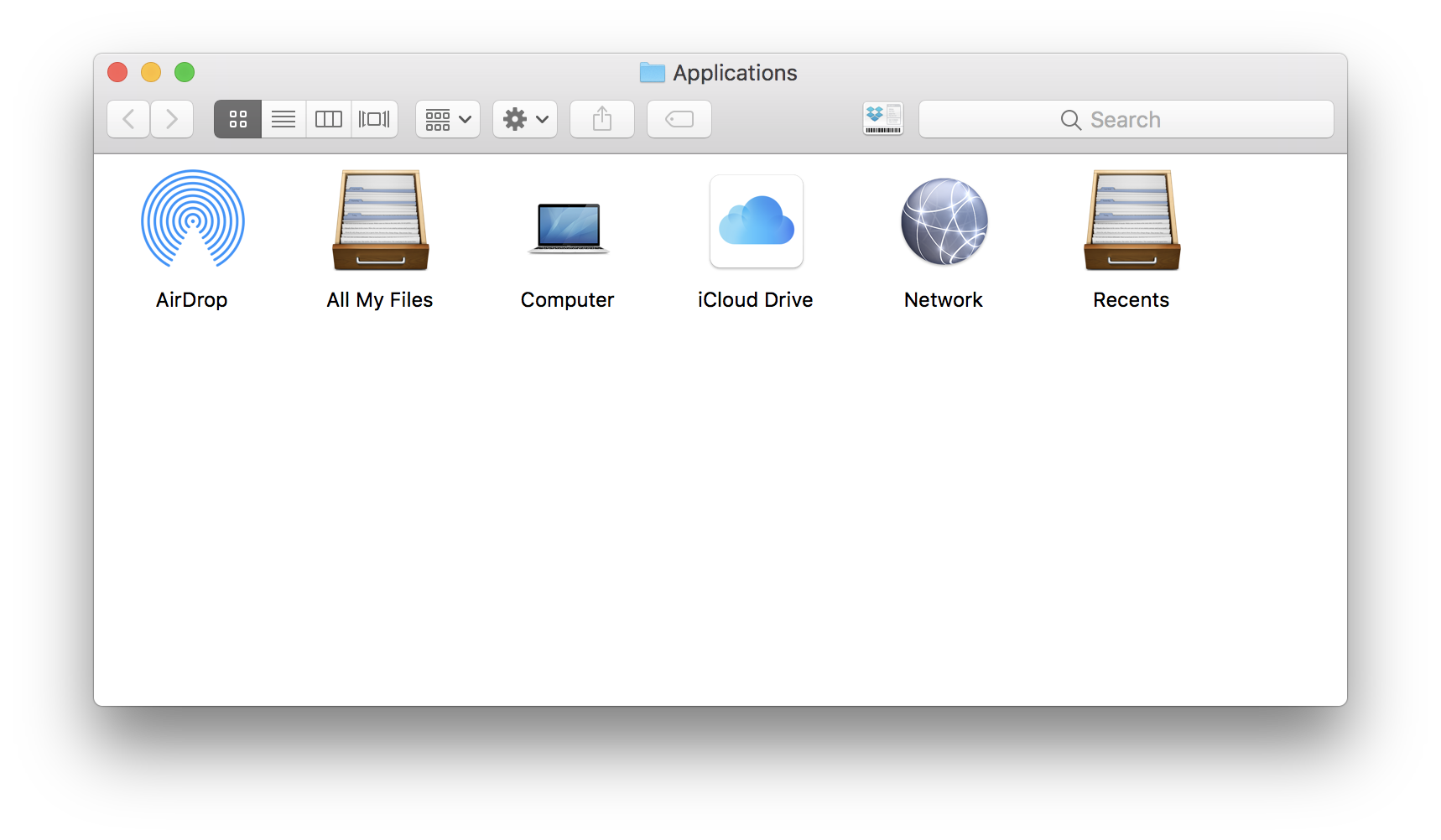
How to put the iCloud Drive Icon on Your Dock
There is a hidden directory inside of macOS that contains the app icons for built-in services like iCloud Drive. You probably wouldn’t know they are there because you’ll have to enter a specific file path in order to access them. Here’s how to put the iCloud Drive Icon on your dock for easy access to Apple’s cloud storage.
2018.04.28.
Washed my Apple Watch band. Now it hangs on the drier as it should.

2018.04.26.
dumber phone – nomasters
This setup will cause you to be less responsive on chats and email, but that’s sort of the point. Your phone shouldn’t dictate to you what you focus your attention on, and the behavior it cultivates in keeping you “always ready” is unhealthy and spills over into parts of our lives that aren’t serving us well.
Although I don't agree with everything, this the sanest article that gives you tips about phone addiction, without going into extremes. I'm already doing a lot of these tips, I just need to revise my notification settings.
Things already got a great URL scheme which can be used for automation. On the Mac, we can take automation to the next level with things.sh which is a Terminal interface for reading (and writing) Things’ database. Really awesome for somebody like me, who spends his day in vim and tmux.
2018.04.15.
Cal Newport writes about owning your content on the social web:
Buy a domain. Setup a web hosting account […]. Install WordPress or hand-code a website for this account. Let people follow you directly by checking your site, or subscribing to an RSS feed or email newsletter.
It was like that couple of years ago, then social media made really really easy for everyone to tell their story. The problem is that your story is now tied to some company that controls basically everything outside a textarea which you use to tell your story. That's way more limiting than having your own website or blog which you control as a whole. Sure, it takes a bit more work to set up a website and you may have to hire a professional to help you, but it's way more satisfying at the end than creating a Twitter account or a Facebook page.
One more thought for Twitter users: if you want to tell something which needs a thread of multiple tweets then write a blog post instead. That's how we used to do it.
2018.04.13.
RSS changes
I separated my shorter statuses and longer posts into two new categories, which means you can subscribe to them individually now. Here's each new category and RSS feed:
- Everything: http://decoding.io/feed/
- Statuses: http://decoding.io/category/statuses/feed/
- Posts: http://decoding.io/category/posts/feed/
If you're into social timelines, then you can also follow me on Twitter or Micro.blog. They are mirroring the blog's content.
I’m officially getting older. I had to increase my coding font (Source Code Pro) from 12pt to 13pt.
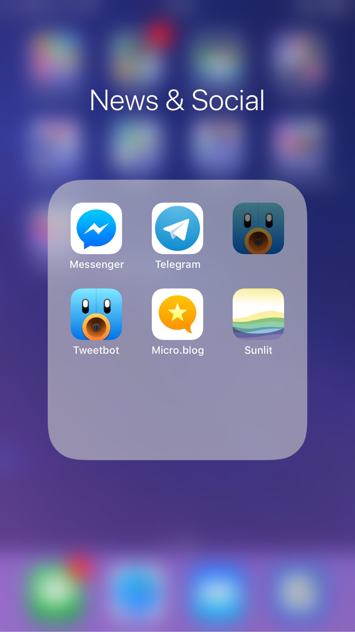
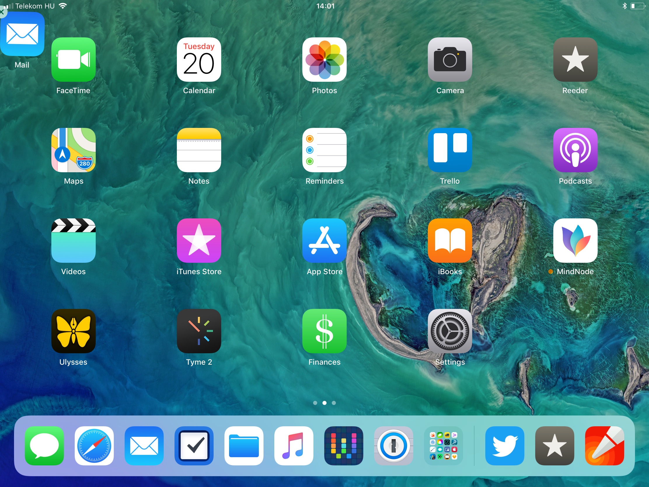
I love these home screen bugs in iOS 11. I had Mail.app trying to escape, now I have a ghost Tweetbot icon.
2018.04.10.
Fixing Safari syncing issues in iOS 11.3
I had syncing problems with Safari since the first version of iOS 11.3 beta. Apparently, I'm not the only one. It’s started getting so bad, that I had to abandon Reading List in Safari because it's randomly deleted saved articles. Sometimes there were random bookmarks showing up in the sidebar. Sites that looked like were added there by Frequently Visited Sites.
I got suspicious about this: maybe Frequently Visited Sites does something weird with syncing. I went ahead and turned it off on every device I own, also on each device that my girlfriend uses since she has a really big collection of bookmarks in Safari. After using Safari for weeks without Frequently Visited Sites turned on, I can safely say it fixed syncing problems. I haven't seen lost bookmarks and deleted articles in Reading List since then.
If you have bugs like this, turn off Frequently Visited Sites in settings on every device that syncs with your iCloud account.
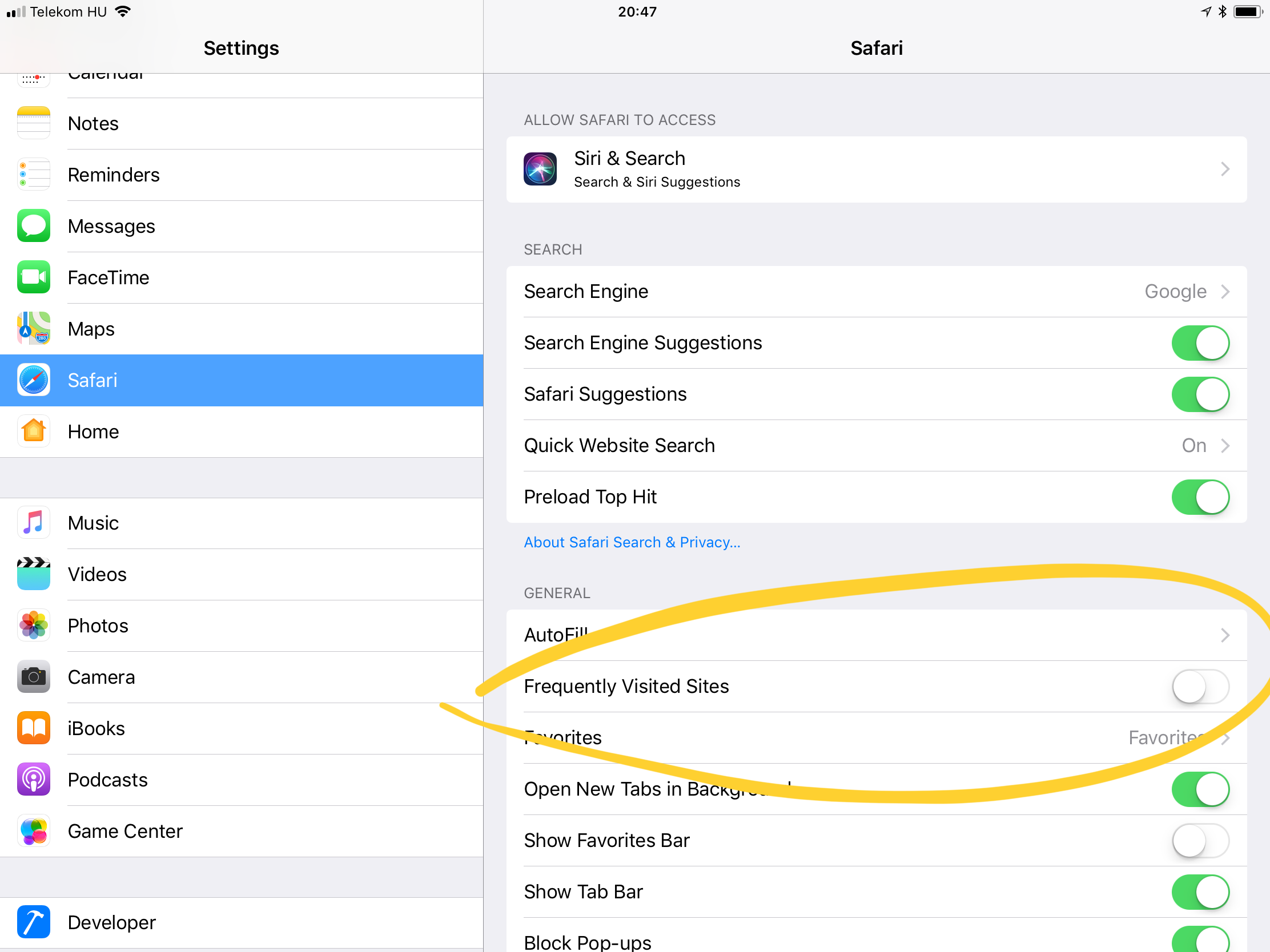
On iOS:
- Go to Settings.
- Find Safari.
- Turn off Frequently Visited Sites.
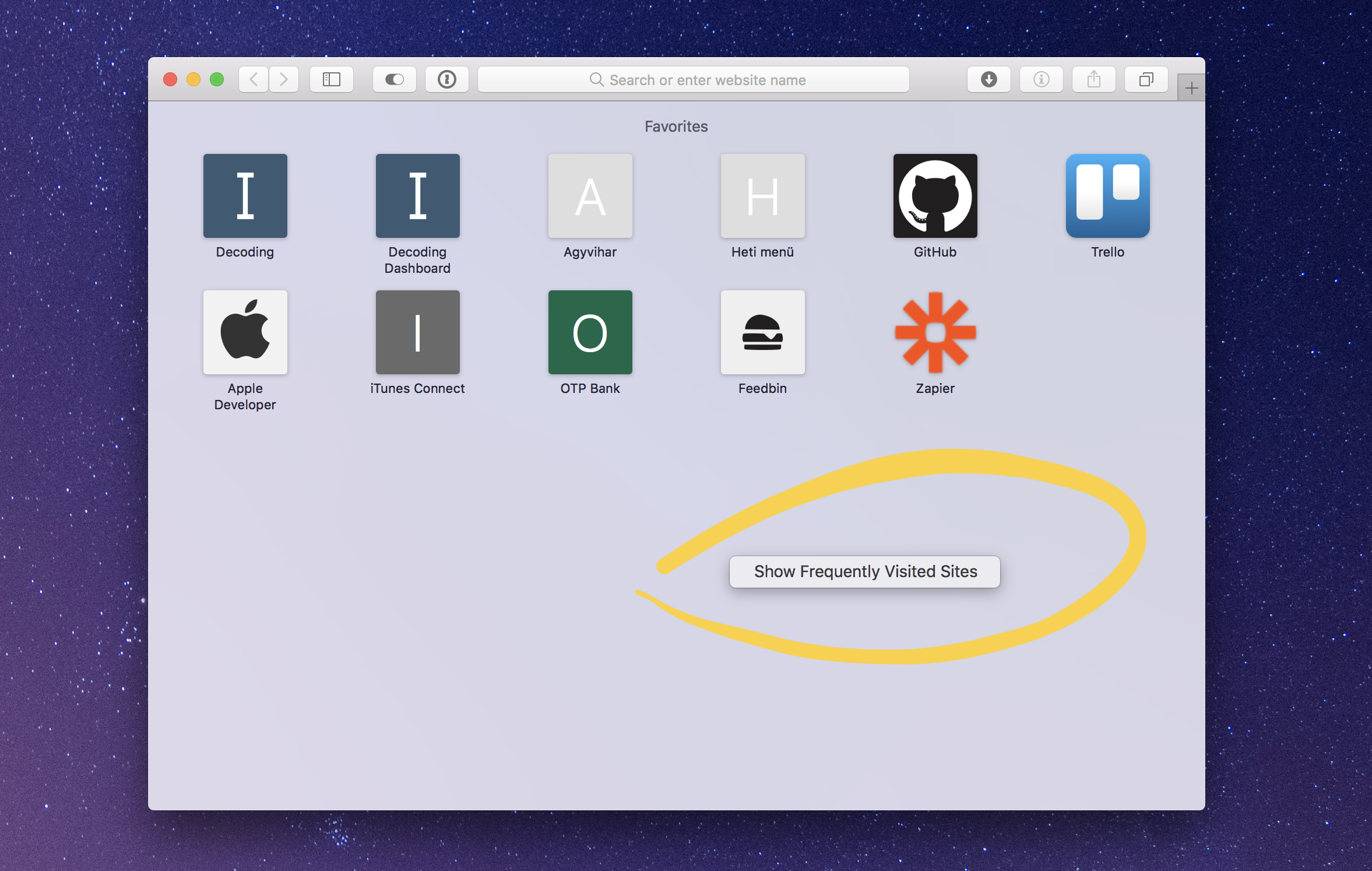
On macOS:
- Open a new tab or window in Safari.
- Control-click somewhere on the empty space.
- Turn off Show Frequently Visited Sites.
2018.04.07.
Wired has a nice collection of repeated apologies from Mark Zuckerberg over the last decade.
Last month, Facebook once again garnered widespread attention with a privacy related backlash when it became widely known that, between 2008 and 2015, it had allowed hundreds, maybe thousands, of apps to scrape voluminous data from Facebook users—not just from the users who had downloaded the apps, but detailed information from all their friends as well.
I’m getting tired of all Facebook’s crap so I have to get rid of it completely. I’m sure there is a shadow profile of me on Facebook servers even I deleted my account about a year ago.
I have Messenger on my phone with no access to photos, my location nor my contacts. My next goal is to get rid of that junk and move my communication of Android people over to Telegram. Luckily a lot of my friends and family use iOS devices.
2018.04.05.
Maybe I’m a bit masochist but I’ve always found SQL a really useful skill to have for filtering and aggregating a lot of data. I found this site which can help me master this a bit more with PostgreSQL, although the logic can be reused in any SQL based database backend.
2018.03.23.
Getting back the “None” tag filter in Things for Mac
Things 2 had a filter for to-dos that doesn’t have any tags attached. It was useful especially if you’re a tag completist like me, but apparently Things 3 had it removed. I’ve just read this Things 3 review yesterday and it mentions a hidden preference in Things 3, which brings back this filter:
As I created and used tags, I realized that there was no way to filter a view by items without a tag. This made me anxious that there were tasks missing tags and only visible when looking at all items in a view. So I reached out to support and learned that the “None” filter was a removed feature from a previous version of Things, and they were happy to give me the Terminal command to resurrect it! So yes, I’m a fan of Cultured Code’s customer support.
Well, he don’t mention how to bring it back, so I’ve asked Cultured Code. Here’s what you have to do:
- Quit Things.
- Go to Applications → Utilities and open Terminal app.
- Copy and paste this command into Terminal, then hit Return:
defaults write com.culturedcode.ThingsMac NoneTagEnabled -bool YES
As you expect, it brings back the “None” tag filter option.
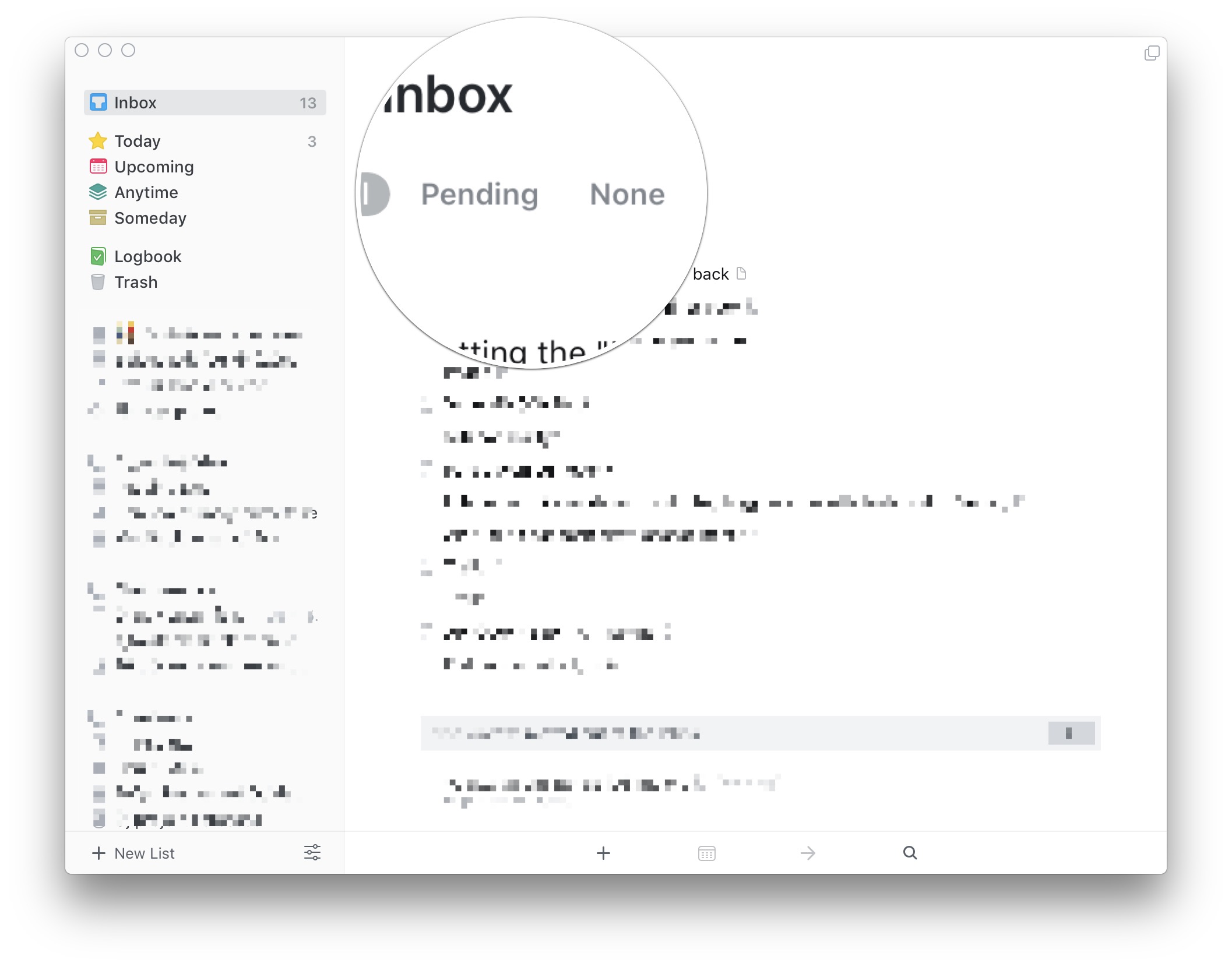
Apparently, it works only on the Mac, but it’s still a useful option to have. Maybe Cultured Code will change its mind, and brings it back to iOS too.
2018.03.20.
Mail.app, what the fuck are you doing?
2018.03.17.
What you and me really are, is just a dash between two dates.
Meditation as a design tool
And that’s how I discovered that meditation is an incredible design and problem solving tool. Instead of wasting hours browsing the internet looking for a solution or an idea, I sit in my room, close my eyes and simply think about the problem. It’s an incredibly useful exercise and more often than not, I come up with solutions faster that I’d do by browsing randomly the internet.
It sounds like the "walking meditation" practice that Cal Newport mentions in Deep Work. When you want solve a problem, get away from your computer and go for walk focusing on the problem. You'll get a solution almost every time.
2018.03.14.
I really like BazQux Reader lately. It can add even userfeeds from Twitter—which is really hard to do since Twitter removed RSS—so I’ve made a workflow which helps me subscribe to accounts from Twitter or Micro.blog. This way, I can follow everything in one app.
2018.03.13.
How to Implement a Killer GTD System in Google Sheets
Sometimes it can be boring to read about other people productivity systems, but this one really interesting. If you can’t find a GTD app that satisfies your needs, maybe you should try a plain old spreadsheet.
2018.03.11.
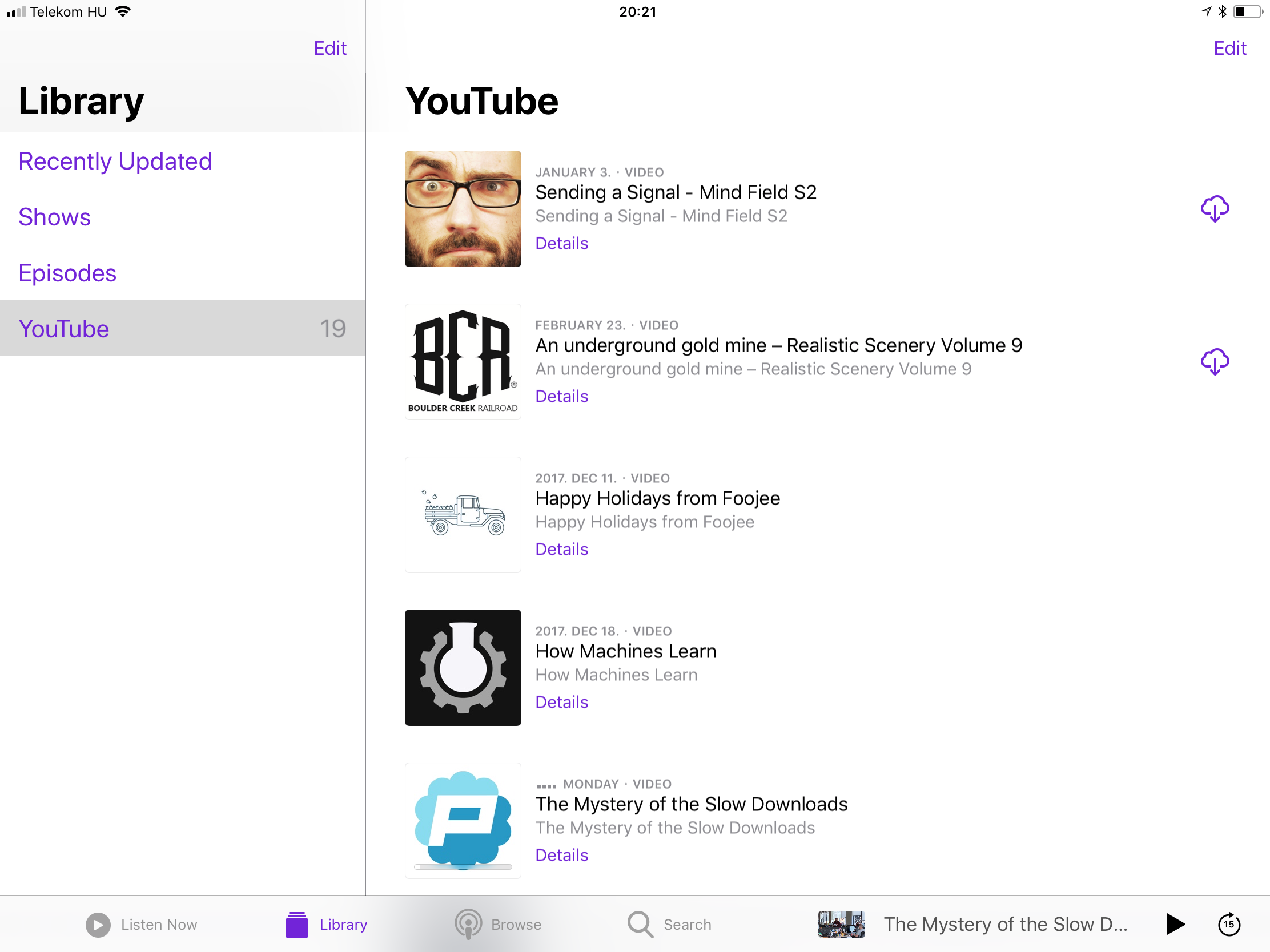
Getting YouTube content in a podcast format
There used to be a lot of video podcasts back in 2010 (yes, you can create video podcasts too). Then suddenly a lot of that content disappeared and/or moved to YouTube. Everybody says that one of the best things about podcasting is that it's a completely independent medium, so I'm not sure why video people are so obsessed with YouTube, but that's a topic for another talk…
Anyway, since the podcasting format is a way better method to follow my favorite channels than the YouTube app, I started to dig around on the web to find a way to subscribe YouTube channels in iTunes or the Podcasts app (or in any podcast app). After a couple of minutes, I've found Podsync which helps me do just that. I can paste the link of a YouTube channel into Podsync, then instantly get a URL of a podcast feed which I can subscribe too in my podcast app of choice (no Overcast support at the moment, because it doesn't support video podcasts).
Why do I want to do that?
- Google can't track me from a podcast client.
- No ads (although I should support my favorite channels on Patreon or something).
- Every video player is better than the YouTube website/app. iTunes and Podcasts have picture-in-picture built-in, which is awesome.
- Since Podcasts downloads every new episode by default, I can follow my favorite channels even in offline mode.
- No related videos are being shown while I watch an episode, which may help to reduce my hours watching YouTube.
- Every multimedia content I follow is in one app now.
I love this way of getting new content from YouTube. I even became a monthly Patreon supporter of Podsync—it's just $1—which has some nice added bonus features like audio–only channels. If you're following a lot of channels on YouTube, but don't like the iOS app, you should take a look at Podsync.
2018.03.05.
David Sparks writing about scheduling his workdays:
I treat the blocks of time more like versatile soup ingredients than a rigid jigsaw puzzle, so I am happy to move them around as I'm planning the next day.
I like this analogy of the calendar working like a puzzle where I can put and arrange pieces of my time as blocks. The problem is making a daily plan then scheduling my whole day simply doesn't work for me. This system feels too restrictive, and believe me, I tried it. It was creating unwanted stress and admin work because I got into the flow, ignored notifications then rescheduled stuff constantly.
I like the idea though. Also, currently I have a longstanding problem reviewing my right task lists at the right moment. Using my calendar, I'll try to schedule blocks of work categories, like @Home or @Admin which are representing context lists in my GTD system. I hope it will start to form at least a list review habit for me, so I can start to trust more in my system.
The secret for this—as with many things—is trying to not overdo it.
2018.03.01.
On grayscaling your phone addiction
I'm trying out a new display setting in iOS to use in evenings. There have been a couple blog posts lately talking about grayscaling your screen, which should help with phone addiction. For me, it looks like just another productivity fad, but having a gray screen could help relax my eyes at night a bit more (using in conjunction with Night Shift).
I’ve added Color Filters setting to my Accessibility menu so it’s a quick toggle in Control Center. I can easily turn on when I want to use it. This’ll make the following gray home screen which is nice for reading in the dark.

But don’t believe it will help you deal with your phone addiction. If you think it does, then I assure you it’s just another placebo effect like when people are blocking Facebook in their browser, because they think it will help them using it less.
Well, I don’t want to pop the productivity bubble of blocking stuff, but what helps is deleting your account from Facebook. The same applies to phone addiction: you have to remove those time-wasting apps from your devices and then be mindful of how you’re using your phone. Turning on an accessibility setting then complaining about colored app icons that make us addictive to stuff is just stupid. Addiction is a way bigger problem than that. You have to acknowledge that your phone is just a tool and it’s your responsibility what you’re using it for.
2018.02.24.
Simple tool from the MindNode guys to automate App Store screenshot creation.