Three was a topic I saw a couple of days ago on /gtd, where redditors discussed which GTD app is the most good looking. It reminded me of a problem I wanted to write about for a while now: their list design’s readability. I know OmniFocus, Things, and Reminders well, so I concluded my experience about their typography below:
A lot of people would say it’s Things. It has a friendly UI, but from a readability point of view, it is one of the worst.
In my daily work, I have two problems with Things:
- It only displays one line per task, which means, if you have longer task titles, you’ll end with a bunch of text clipped out, which is annoying on an iPhone. You have to open each task to see the full title, which is no fun when you quickly want to review your errands list.
- Things displays every task list grouped by project. If you like me, you’ll usually have one next action per project, so having each project being this prominent is making your lists very noisy.
I stopped using Things because of these issues, and I switched back to OmniFocus, which displays full task titles, and has nicer list readability overall. Apple Reminder is also good at showing lists, which matters the most at the end, so I would go with OmniFocus and Reminders.
Let’s see these apps next to each other. From left to right are OmniFocus, Reminders, and Things.
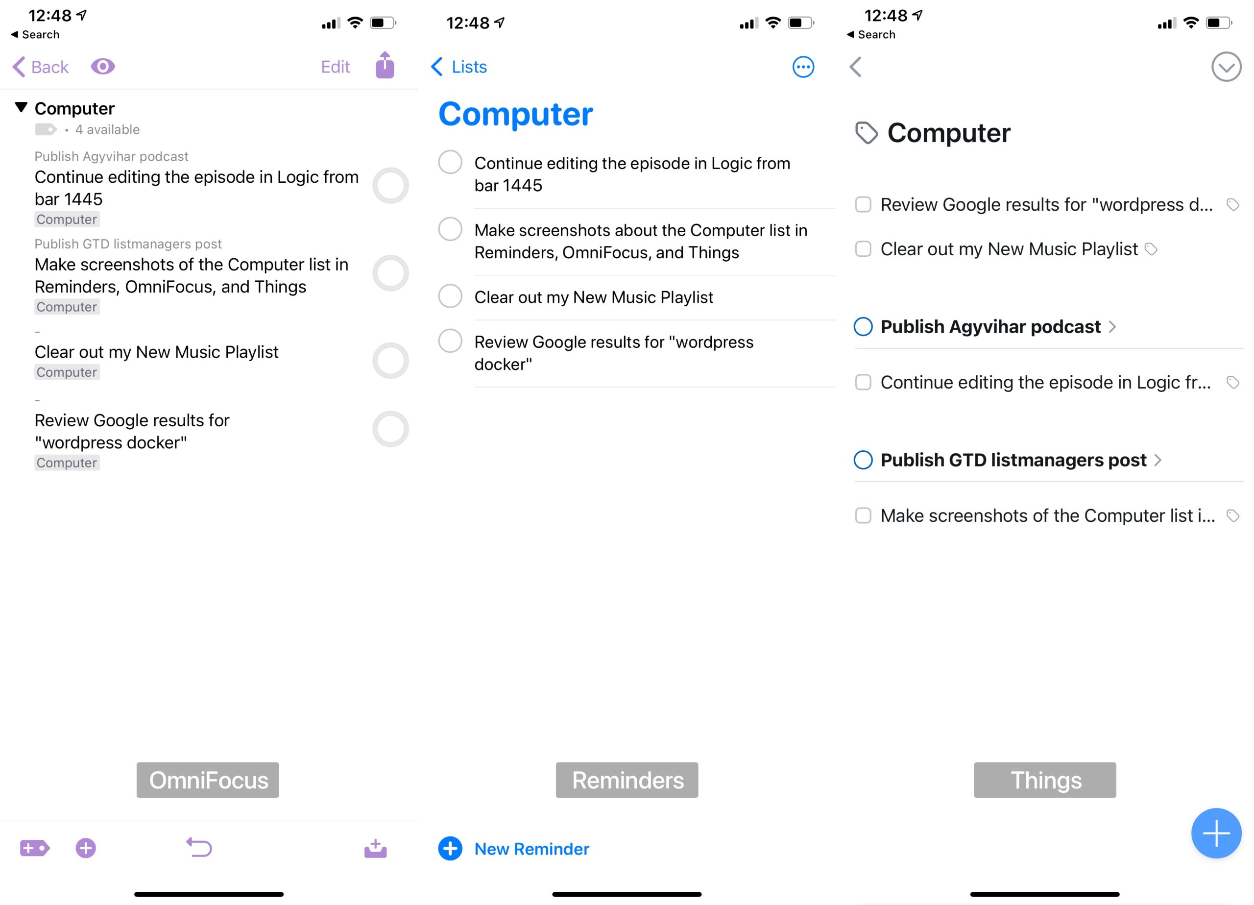
As you can see, Things overflows the text and group actions by projects which makes the readability of a typical next actions list much worse. It was the main reason I left Things after using it for two years and switched back to OmniFocus.
I also made a switch from OmniFocus to Reminders in December, but that’s a topic of another post.
Hi Zsolt,
looking forward to why you moved to Reminders. I am also currently trying to get GTD implemented only with Apple’S onboard tools like Reminders. So curious to your reasoning.
Stay safe,
Florian
Thanks for your +1 on this, Zsolt!
Oohhhhh maaaaan this is a very very important thing you pointed out. I fully support this.