Entering date and time values into an application is hard. I combined these two interactions into one UI to make things easier. Here’s how I did it.
How the date picker works
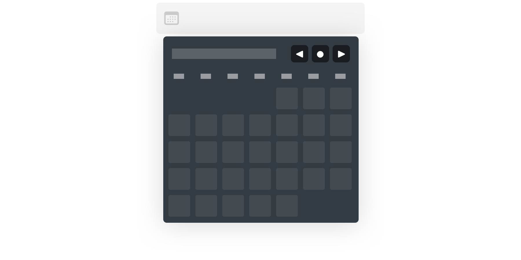
On a simple scale, a date picker is just a table with six rows and seven columns. As a skeleton for the calendar, we have to fill this table with dates using rows and columns as coordinates for each day.
With this in mind, we can already assume some essential bits.
- Some months spans across six weeks, so we need six rows.
- Columns represent days with a fixed order, so Monday is anchored to 0, Tuesday to 1, Wednesday to 2, etc.
- We can go back and forth between months just by adding and subtracting the current month offset.
- We're always working with two dates: one currently selected, and proposing another one as a new value for the input field. These dates can be on the same day, but we're not concerned with that.
These are the basic building blocks of our date picker, so we can see how these pieces fit together with a little bit of diagramming.
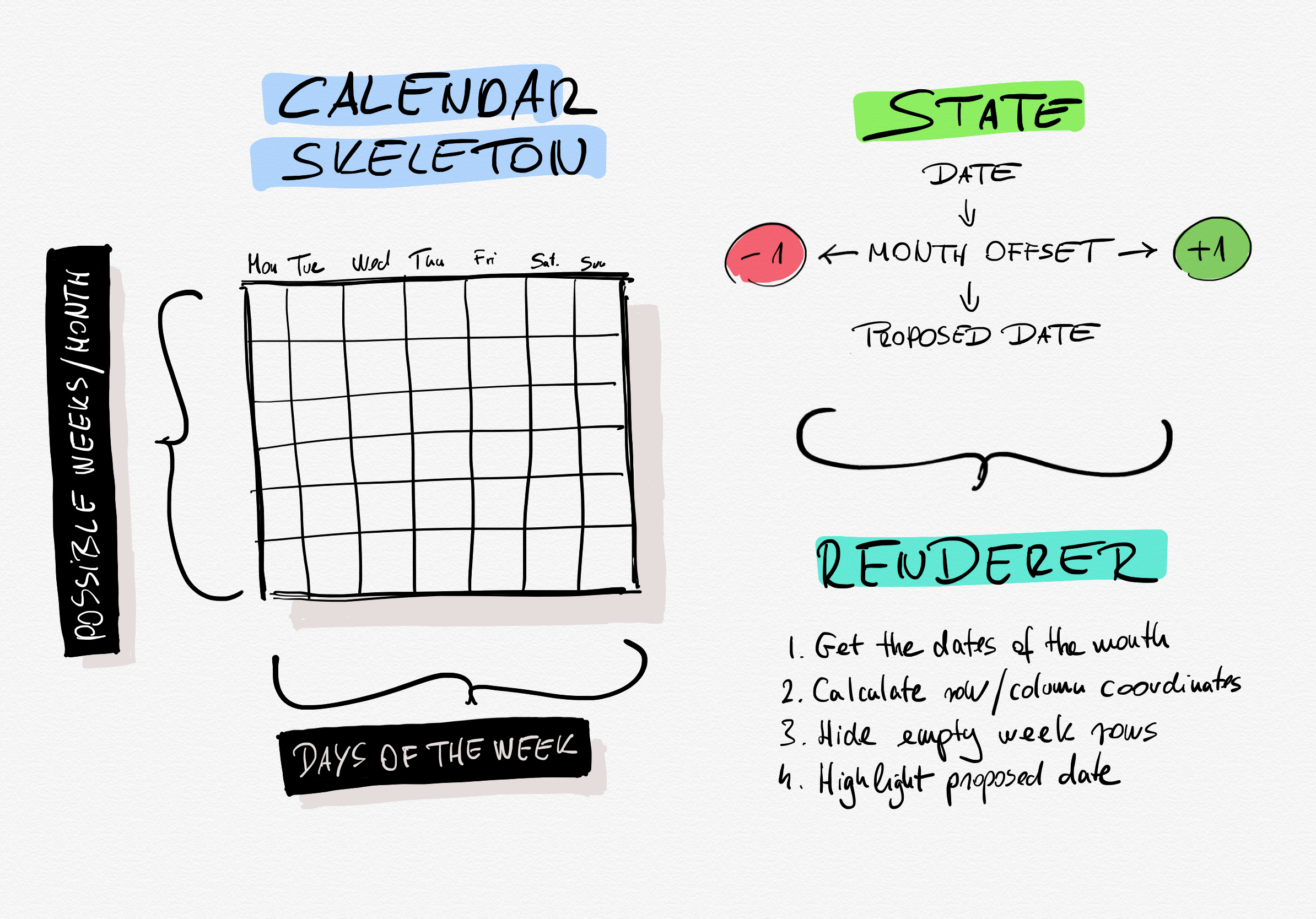
The date picker is using three layers of models.
- The HTML view draws the rows of columns of the calendar skeleton and some UI parts.
- The state/controller layer changes the date, proposed date, and month offset values responding to events—also parsing dates.
- The renderer, which is a reactive layer, watching state changes and echoing each day of the subjected month into the correct row and column coordinate. Also showing or hiding remaining empty week rows.
A quick word about popovers
We will base the date picker on another Stimulus controller, which acts as a popover. This controller's task is to attach itself to a button or link and toggle its target box on and off. The date picker is also acting as a popover, so instead of building it into the date picker controller, we can extract this behavior and use it separately. It's also a great example of how multiple Stimulus controllers can work together.
The view
The date picker will be a part of a Rails app, so we will use its features to render the view part without any fuss.
First, there is a shared partial under app/views/shared/_date_picker.html, which contains the required HTML. It has a couple of jobs.
- Since there is a separate Stimulus controller for the popover functionality, the view should generate a random ID property for each date picker. Having different IDs allows us to have more than one date picker instance on the same page and we’re toggling the right one on or off.
- It creates a
text_fieldto attach the date picker to it in the parent form. - This partial also maps Stimulus targets and events to each controller.
- Since day names are not going to change in this example, the partial can prerender a table header so that day names can come from the global
I18nlocalizations. - For the calendar skeleton, we have to render an empty table body for six rows and seven columns.
- The UI also needs two additional hour and minute fields to change the time.
The other part of the view is a custom FormBuilder class, making two new methods available in a form_for block. The date_picker_field and date_time_picker_field are simple methods rendering the _date_picker.html.erb partial into any form. This way, we can seamlessly use the date picker like any other Rails form helpers.
To make our job a bit easier, we can create an additional global helper method called record_form_for, which can be used in place of the standard form_for to make our customized FormBuilder subclass available everywhere in the view.
Styling
As I mentioned before, we will show the date picker in a popover, so we should base its styling on the popover base class. We can do this by extending the base .popover CSS class with a .date_picker_popover to target all date picker specific CSS in a custom popover class.
Our date picker has styles for the navigation buttons, the day names header, the calendar view, and the optional time picker fields. Also, it overrides the base .show class to show the popover with a custom animation.
The base .date_picker_popover class is also scaled down by 0.825 using the transform attribute for desktop browsers because there we have more precise mouse-based input. We scale back to the original size on touch devices to have bigger tap targets.
The Stimulus controller
Our controller has two distinct layers separated into two pieces. One is the renderer, which uses a JavaScript Proxy object; the other is the controller itself, which has a state object and a couple of methods that respond to events and modify properties on the state. The renderer part watches these changes and updates the UI reactively.
Let’s start with the first piece. On a higher level, this is our renderer without any implementation code. The first part sets attribute values on the state object; the second part runs the UI manipulation code responding to those changes.
renderer = {
  set: (target, property, value) => {
    // Set the value of the state object then respond to those changes down below.
    target[property] = value

    if (property === 'proposedDate') {
      console.log('Render the calendar and optionally set the date.')
    }

    if (property === 'date') {
      console.log('Set the value of the date field')
    }

    if (property === 'month') {
      console.log('Render the calendar responding to month changes.')
    }

    if (property === 'started' && value === false) {
      console.log('Dismiss the UI.')
    }

    return true
  }
}
The code example above is a compelling way to manipulate the UI. We can set a couple of values on the state which gets updated by the controller, but we extracted our UI manipulation code into a renderer. You can run wild and create an entirely separate module for the renderer, you can even have multiple renderers, one for a desktop and one for mobile, but I like to keep them in the controller since we have access to everything in it via this as well.
To use the renderer, we have to proxy it through the state object. The best place for this is in the controller connect method, which runs when Stimulus connects the controller to the HTML view.
connect() {
  this.state = new Proxy({}, this.renderer)

  this.dateFieldTarget.readOnly = this.isTouch
  this.timePickerTarget.style.display = this.isTimeActive ? 'flex' : 'none'
}
You may also notice that other parts of the code deal with displaying the time picker fields and changing attributes on the date field. Why not move these pieces into the renderer?
Since these changes happen once, it’s better to keep them in the connect method. Sure we can extract them into state properties, but since we don’t update them anymore in the controller’s lifecycle, it’s easier to deal with them right here. Having this flexibility is why Stimulus is so awesome. You don’t have to deal with a predefined reactive state like in other frameworks; you can create your own if you want using native JavaScript features, but you can also update the DOM directly from anywhere if that fits your code better.
Now let’s talk about the most critical parts of the controller’s skeleton.
import { Controller } from "stimulus"

export default class extends Controller {
  static targets = [
    // ...
  ]

  currentMonth(event) {
    // ...
  }

  nextMonth(event) {
    // ...
  }

  previousMonth() {
    // ...
  }

  pickDate(event) {
    // ...
  }

  start(event) {
    // ...
  }

  parseDate(event) {
    // ...
  }

  dismiss(event) {
    // ...
  }

  getCoordinates(date) {
    // ...
  }
}
currentMonth: Resets thestate.dateto the current date andstate.monthto 0. The method above gets called when we press the Today button.nextMonth: Goes to the next month by adding 1 to thestate.monthwhen we press the right arrow on the top of the date picker.previousMonth: It does the opposite of its counterpart and goes to the previous month by subtracting one from thestate.month. It also gets called when we press the left arrow on the top of the date picker.pickDate(event): Handles the click event on a picked date from the calendar and set the value of thedateFieldTarget. Thedata-action="click->date-picker#pickDate"isn’t in the HTML view; instead, it added dynamically by the renderer part. The good thing is that Stimulus picks up these data attributes automatically, so dynamic event handling works without doing anything special on our part.start: Gets called when we focus on the date field so the date picker can start its whole date parsing and rendering process.parseDate: The date parser part processes the value ofdateFieldTargetusing Chrono and sets thestate.proposedDate, which gets highlighted by the renderer as a possible date or date-time value for thedateFieldTarget. It is very flexible, accepts input from thedateFieldTargetlike “tomorrow evening” or “next month”.dismiss: There are multiple ways in the flow where the date and time picking interaction ends, like pressing Return in one of the time picker input fields, selecting a date from the calendar, or using the natural language parser. Since we’re having a separate controller for the popover state, this method sets thestate.startedvalue tofalseso the renderer can hide the date picker using thePopoverToggleController.getCoordinates: Gets called on each date of the current month by the renderer to determine which row and column it should modify in the DOM when the calendar gets filled with dates. It returns an object like{ row: 1, column: 4 }.
We also have some other helpers in the controller, but the main logic runs in the methods listed above. The cool thing is that there is no DOM manipulation code here; we change a couple of values on the state, do some date and time calculation using Chrono and Moment.js, but that’s it. It’s simple and easy to understand.
UI behaviors
A date picker seems a simple component, but it has a surprisingly complex behavior set. It’s essential to get this right because picking a date isn't a fun thing to do. Our date picker should get this job done quickly then get out of the way.
And it has to work in multiple ways to remain flexible for a different type of people. Let's see how these behaviors can work together to add up as a flexible tool.
1. Animations
Animations used right can bring our attention to something, surprise us, or even bring a bit of joy to an otherwise dull task.
We attached our date picker to an input field, so in our example, we mark these fields with a calendar icon to indicate what type of data we’re expecting. It makes sense to use this icon as an anchor point for our animation. The date picker grows out from the left side of the input field when we click on it, indicating that it has to do something with the calendar.
When the animation finishes, there is a small bounce, which gives a bit of playfulness to the UI.
2. 2-way data update
We have two types of input methods for the date picker.
- Typing values in the date field.
- Selecting dates in the calendar.
These two have to morph together and be connected. This connection needs to happen in real-time, so it doesn’t matter if we’re typing something in the field or selecting a date in the calendar. We should see changes immediately without switching modes or waiting for something to finish.
3. Click-away date parsing
When people are dealing with popovers, they usually try to exit them by clicking away. We should respect this behavior and remember that we’re dealing with formatted data, so we shouldn’t just leave the raw values in the field. When the user blurs out from the date field, we still have a chance to do a final date parsing to have valid data in our input field. We can give something valuable to the user, even when she wants to exit from the interaction.
4. Keyboard-only access
Power users are very good with keyboards; you can spot them when you see somebody signing up for your service. They give you clues like using the Tab key to switch fields because they want data input interactions to be quick and painless. We can always do more to speed things up for them.
In the case of a date picker, natural language parsing can be robust. We integrated it into the date field, and because of the two-way data binding, you can see it working in realtime. The calendar switches months as you type in a date. Hours and minutes filled into their respective fields.
Everything works from the keyboard. Switching away from the field triggers the click-away date parser mentioned above, so you can press Tab (or Return) and get the correctly formatted date every time.
5. Mouse-only access
In contrast, novice people not accompanied using just the keyboard. Having the date and time picker available as a WYSIWYG-like interface is the whole point of creating a unique controller for this type of field.
Switching months, selecting the date, and adjusting the time can be done via the mouse—no need to type anything. And the 2-way data update also gives instant feedback with the final output.
It’s a great place to mention again that our UI scaling takes the input method into account. On touch devices, the date picker scales up to use the calendar with our fingers without feeling cramped.
Try it for yourself
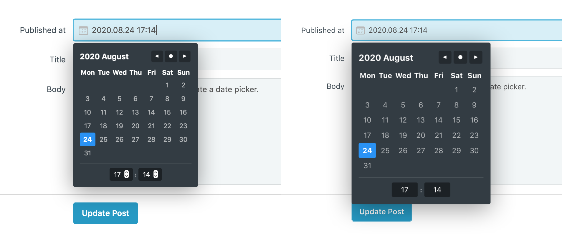
Everything we discussed in this article is also available on GitHub. In our example, we use a simple post model where the date picker is attached to the published date field.
The repository is a simple Rails app without any external dependencies (it uses SQLite for its database), so setting it up should be very easy. All you have to do is to install Rails using this guide, then run rails db:setup and rails server to get it running.
Checkout this project on GitHub
How did you draw that stylish diagram? What software?
I draw it with my iPad and Apple Pencil using Linea. https://linea-app.com/
Awesome, it should be easy to style up with Tailwind!
Thanks for sharing